
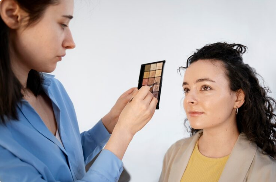
Color has a powerful effect on appearance. The right shade can make your complexion look brighter, your eyes more noticeable, and your overall style more polished. On the other hand, certain colors may make the skin appear dull, tired, or uneven. This is where color analysis becomes useful.
Color analysis is a method of identifying the shades that work best with your natural coloring, particularly your skin undertone. While personal preference should always play a role in what you wear, understanding your undertone can make choosing clothing, makeup, jewelry, and accessories much easier.
What Is a Skin Undertone?
Your skin tone refers to the visible shade of your skin, such as fair, medium, tan, or deep. Undertone, however, is the subtle color underneath the surface of your skin.
Most undertones fall into three broad categories:
- Warm undertones have golden, yellow, peach, or slightly olive characteristics.
- Cool undertones often contain pink, red, or bluish tones.
- Neutral undertones combine elements of both warm and cool coloring.
Skin tone can change depending on sun exposure, tanning, or seasonal differences, but undertone generally remains consistent.
How to Determine Your Undertone
There is no single test that works perfectly for everyone, so comparing several clues usually provides the most accurate result.
Check the Veins on Your Wrist
Look at the veins on the inside of your wrist in natural daylight. If they appear mostly blue or purple, you may have a cool undertone. Green-looking veins can suggest a warm undertone.
If the veins appear somewhere between blue and green, your undertone may be neutral.
However, vein color can be influenced by skin depth and lighting, so it should not be used as the only indicator.
Compare Gold and Silver Jewelry
Try holding both gold and silver jewelry near your face.
Gold jewelry often complements warm undertones, while silver, platinum, and white gold may appear especially flattering on cool undertones.
People with neutral undertones frequently find that both metals suit them well.
Try the White Fabric Test
Place a bright white piece of fabric near your face, followed by something cream or ivory.
Cool undertones often look balanced against crisp white, while warm undertones may appear more harmonious with cream or off-white shades.
Neutral undertones can usually wear both without a noticeable difference.
Best Colors for Warm Undertones
Warm undertones tend to work beautifully with colors inspired by sunlight, autumn landscapes, and earthy environments.
Popular options include:
- Mustard yellow
- Terracotta
- Burnt orange
- Rust
- Coral
- Peach
- Olive green
- Camel
- Warm beige
- Chocolate brown
Warm reds such as tomato red and brick red can also be particularly flattering.
Instead of icy pastels, people with warm undertones may prefer softer warm alternatives such as peach, apricot, cream, and warm lavender.
Best Colors for Cool Undertones
Cool undertones often pair well with crisp, jewel-inspired, and blue-based colors.
Excellent options may include:
- Sapphire blue
- Emerald green
- Royal purple
- Raspberry
- Cranberry
- Cool pink
- Navy
- Icy blue
- Lavender
- Charcoal gray
Blue-based reds, such as cherry and burgundy, are also commonly flattering.
When choosing neutrals, pure white, cool gray, navy, and black can complement cool complexions particularly well.
Best Colors for Neutral Undertones
Neutral undertones provide plenty of flexibility because they contain a balance of warm and cool qualities.
Balanced shades often work especially well, including:
- Dusty rose
- Soft teal
- Jade green
- Medium blue
- Taupe
- Soft white
- Muted purple
- Balanced red
- Sage green
Extremely warm or extremely cool shades may sometimes overpower neutral coloring, but experimentation is important.
Neutral undertones often have the advantage of being able to borrow successfully from both warm and cool palettes.
Understanding Seasonal Color Analysis
Many professional color systems go beyond simple undertone categories and divide people into four traditional seasons: spring, summer, autumn, and winter.
Spring
Spring palettes are generally warm, bright, and fresh.
Common colors include peach, coral, warm turquoise, light green, golden yellow, and cream.
Summer
Summer palettes are usually cool, soft, and muted.
Typical shades include dusty pink, lavender, soft blue, muted navy, cool gray, and berry tones.
Autumn
Autumn palettes are warm, rich, and earthy.
Popular colors include olive, rust, mustard, caramel, chocolate, deep teal, and warm burgundy.
Winter
Winter palettes are generally cool, clear, and high in contrast.
Strong shades such as cobalt blue, emerald, black, pure white, deep purple, and vivid red commonly appear in winter palettes.
Modern color-analysis systems may divide these seasons further into categories such as Soft Autumn, Bright Spring, Cool Winter, or Light Summer.
Using Color Analysis for Makeup
Understanding undertones can also make makeup selection easier.
People with warm undertones may gravitate toward peach blush, coral lipstick, bronze eyeshadow, and golden highlighters.
Cool undertones may look harmonious with rose blush, berry lipstick, plum eyeshadow, and pearl-toned highlighters.
Neutral undertones can experiment with shades from both groups.
Foundation is especially important. A foundation that matches your skin depth but conflicts with your undertone can appear overly pink, orange, yellow, or gray.
Testing foundation along the jawline in natural daylight usually provides a better indication than testing it on the hand.
Choosing Jewelry and Accessories
Color analysis can guide accessory choices as well.
Warm palettes commonly pair beautifully with yellow gold, bronze, copper, tortoiseshell, and warm brown leather.
Cool palettes often coordinate naturally with silver, platinum, white gold, cool-toned gemstones, and black accessories.
Neutral palettes can usually accommodate a wider variety of metals and materials.
Accessories are also an easy way to experiment with colors that may feel too bold for an entire outfit.
Build Your Wardrobe Around Your Best Colors
You do not need to replace your entire wardrobe after discovering your color palette.
Start with the colors closest to your face. Shirts, jackets, scarves, dresses, and tops have a stronger visual effect on the complexion than trousers or shoes.
Choose several flattering neutral shades as the foundation of your wardrobe, then add accent colors that coordinate easily.
For example, someone with warm coloring might build around camel, cream, olive, and brown before adding coral or rust. Someone with cool coloring might choose navy, charcoal, white, and black with accents of berry or cobalt.
This approach can make outfit coordination simpler while helping you shop more intentionally.
Color Analysis Is a Guide, Not a Rule
Personal style should never become restricted by a color chart. If you love a particular shade, you can wear it regardless of whether it appears in your recommended palette.
Color analysis is most useful as a guide. It explains why certain shades may appear especially harmonious and provides a practical starting point when choosing unfamiliar colors.
You can also wear less flattering colors away from your face through shoes, trousers, handbags, belts, or other accessories.
Fashion should ultimately reflect personality as much as natural coloring.
Final Thoughts
Color analysis can transform the way you approach clothing, beauty, and personal style. By identifying your undertone and understanding which palettes complement it, you can make more confident choices and build a wardrobe that feels coordinated and intentional.
Warm, cool, and neutral undertones each have a wide range of flattering possibilities. Seasonal color analysis can refine those options even further, but there is no need to treat the results as strict rules.
The most effective palette is one that enhances your natural features while still allowing you to wear colors that make you feel comfortable, expressive, and confident.
Read more : Bug Bounty Programs: Getting Paid to Hack Ethically
Conversation